We conducted 12 storytelling interviews to understand how different customers buy groceries. We interviewed parents, working professionals, and college students.
To gauge existing solutions and opportunities within the grocery shopping experience, we examined different self-checkout technologies and the psychology of grocery stores and their layouts.
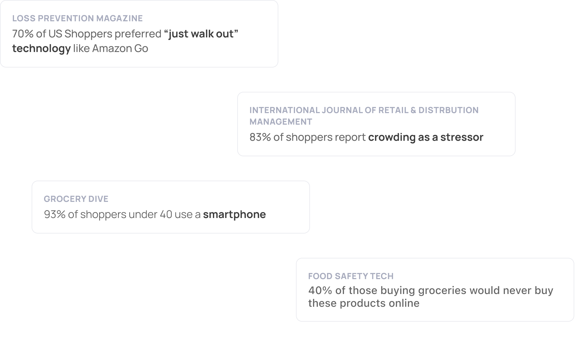
As we narrowed down our focus, we interviewed eight more participants to get more insights into the current state of the checkout experience.
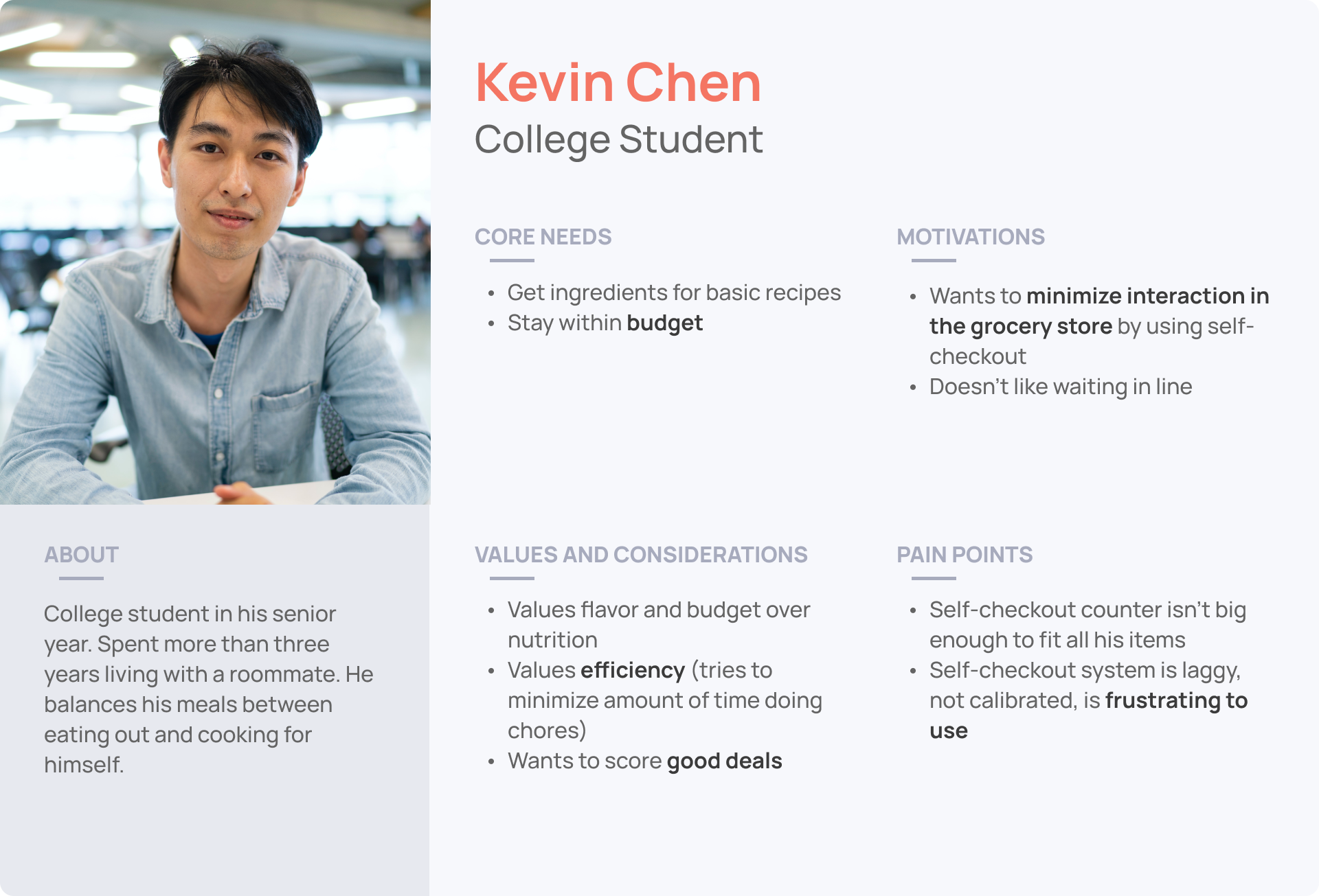
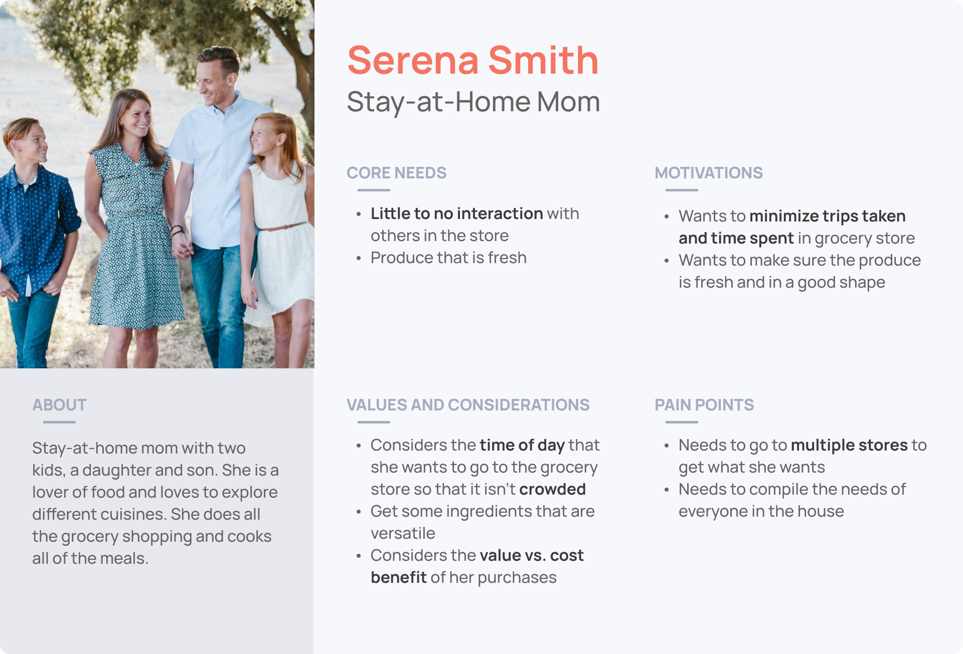
We synthesized our findings by deriving two persona groups: young adults and stay-at-home parents. We reviewed the personas to ensure we relied on research and not intuition.
We diagrammed a journey map from each interview and consolidated the patterns into one journey map. This journey map highlights the pain points at specific stages.
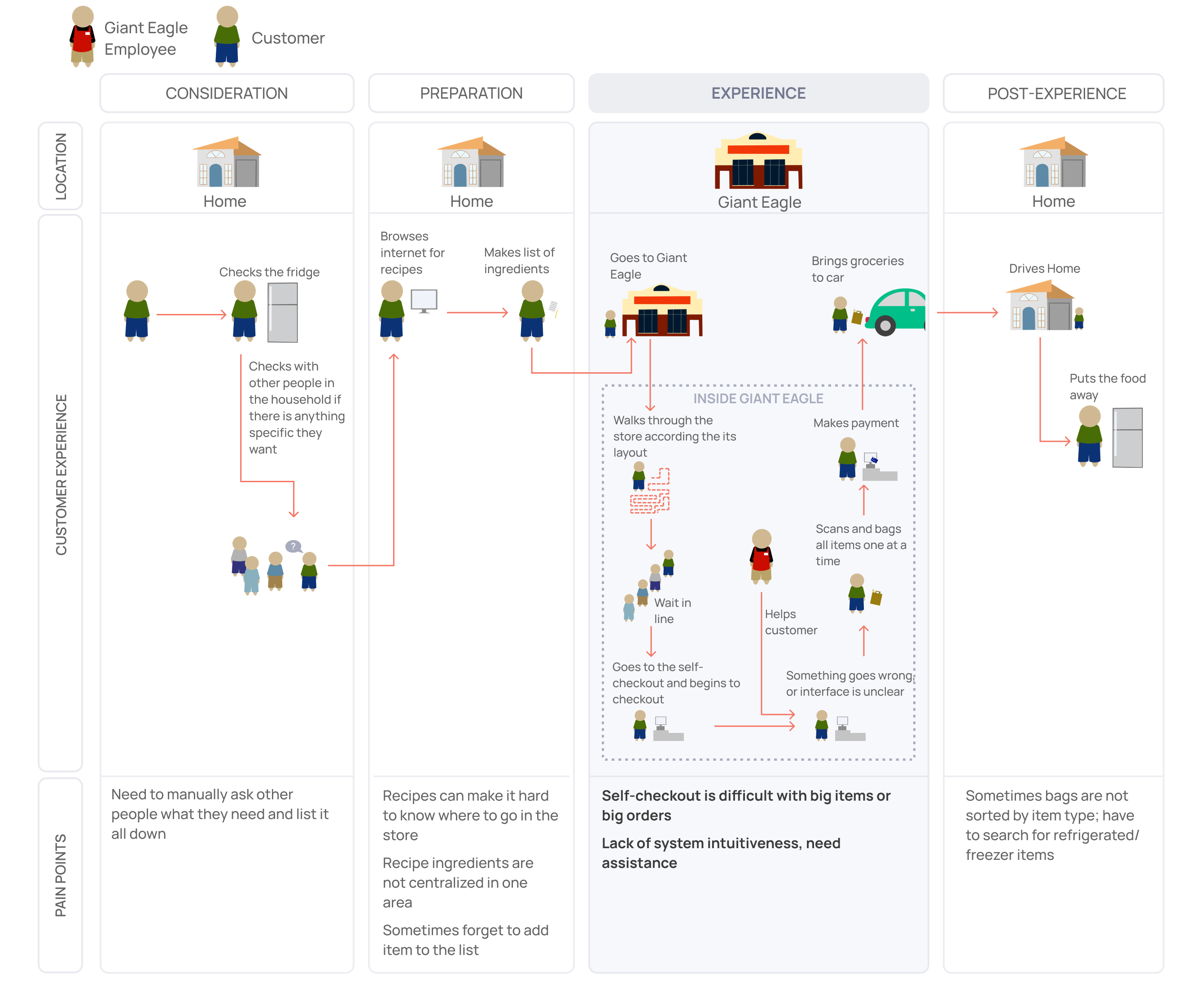
Through the consolidated journey map and personas, our team discovered the following insights:
Insight 1
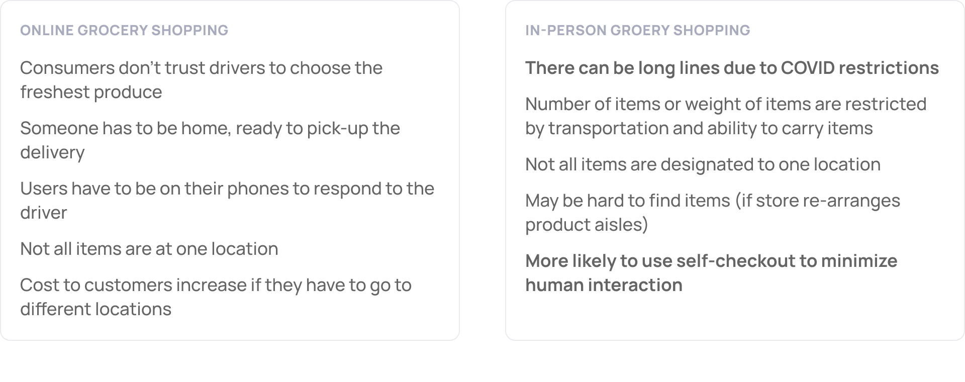
People dislike long wait times and being idle in checkout lines.
Insight 2
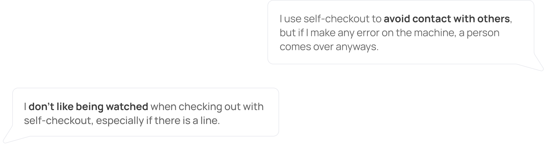
People want to avoid human-human interaction in groceries (even pre-COVID).
Insight 3
People don’t like the feeling of being watched or making mistakes during self-checkout.
Insight 4
People often need help in self-checkout but feel shame when asking for help due to loud store alerts.
How might we make navigating the grocery store and checking out more time-efficient?
Customers are highly stressed by long wait times. The satisfaction of customers who enjoy and don't enjoy grocery shopping is significantly impacted by their wait time.
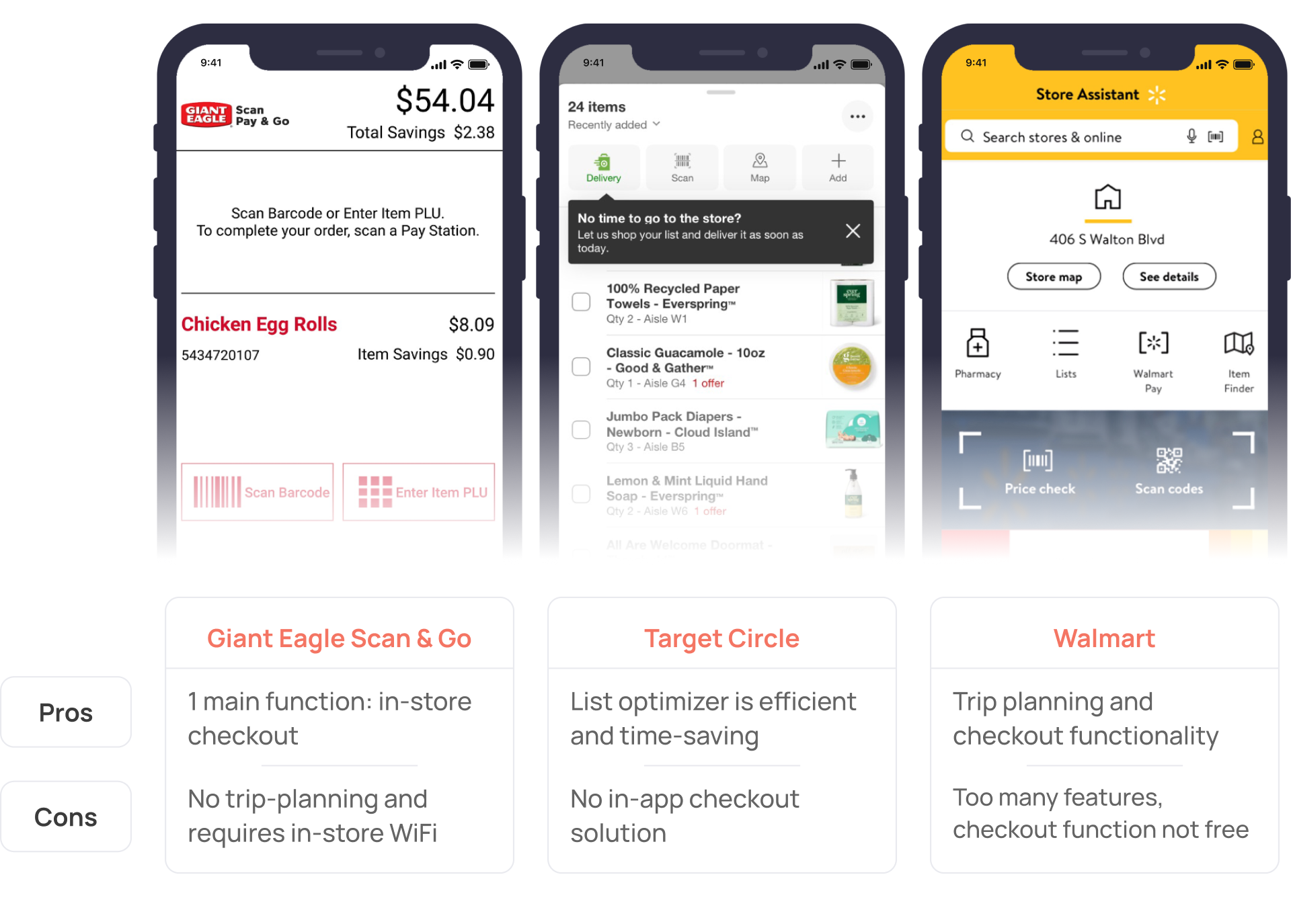
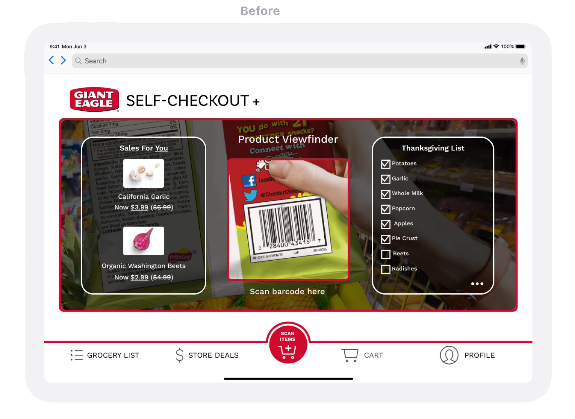
Before ideating, we analyzed three mobile applications in the grocery store space and listed the pros and cons for each.
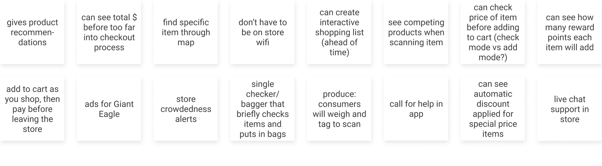
We then timeboxed ourselves and generated quick ideas. We then prioritized some ideas over others based on technical feasibility, impact to the user, and our team's time constraints.
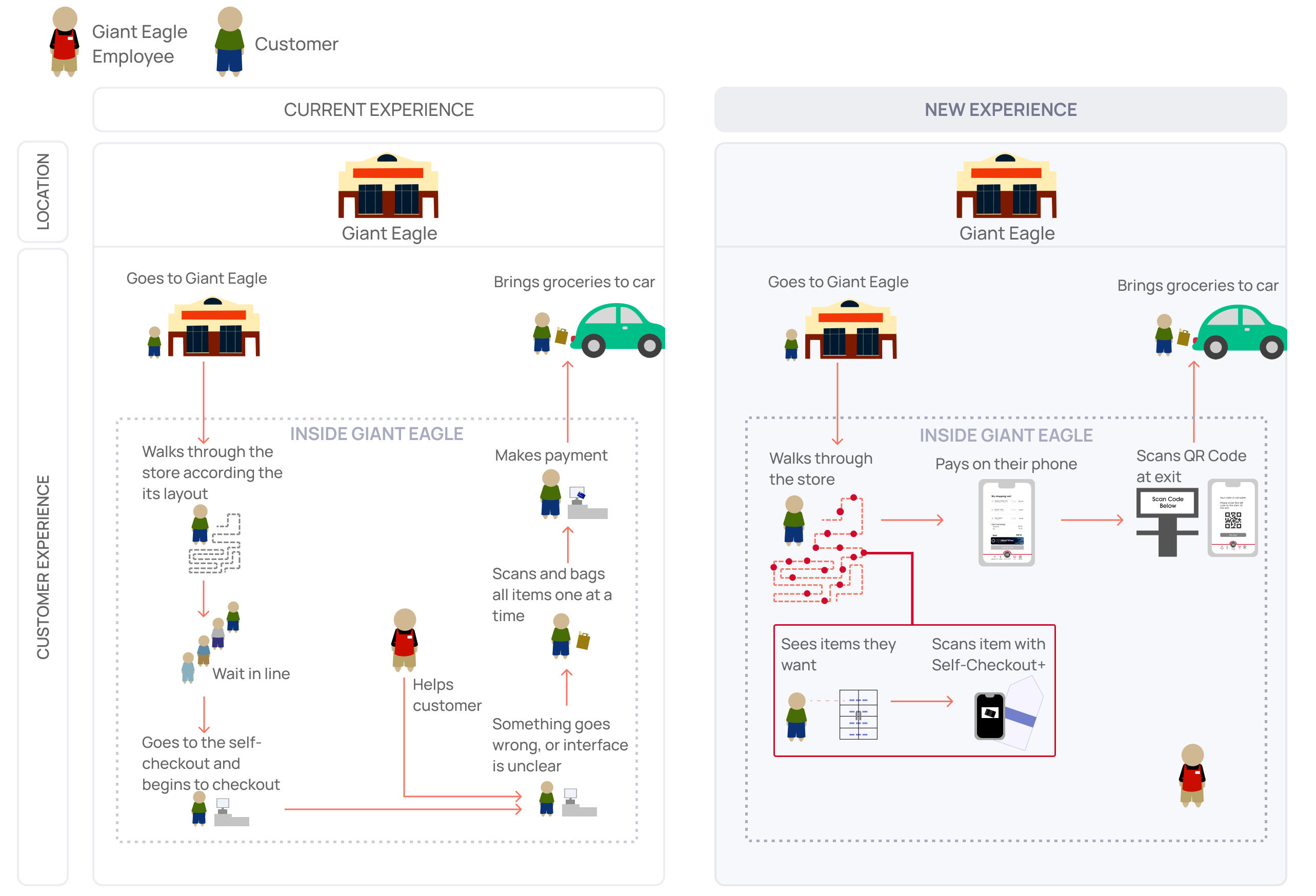
After bundling our ideas, we targeted the experience stage of the grocery shopping experience. Self-Checkout+ innovates the way customers shop and pay for groceries.
We timeboxed the design of our low-fidelity prototype in Figma to emphasize creation and ideation over polish.
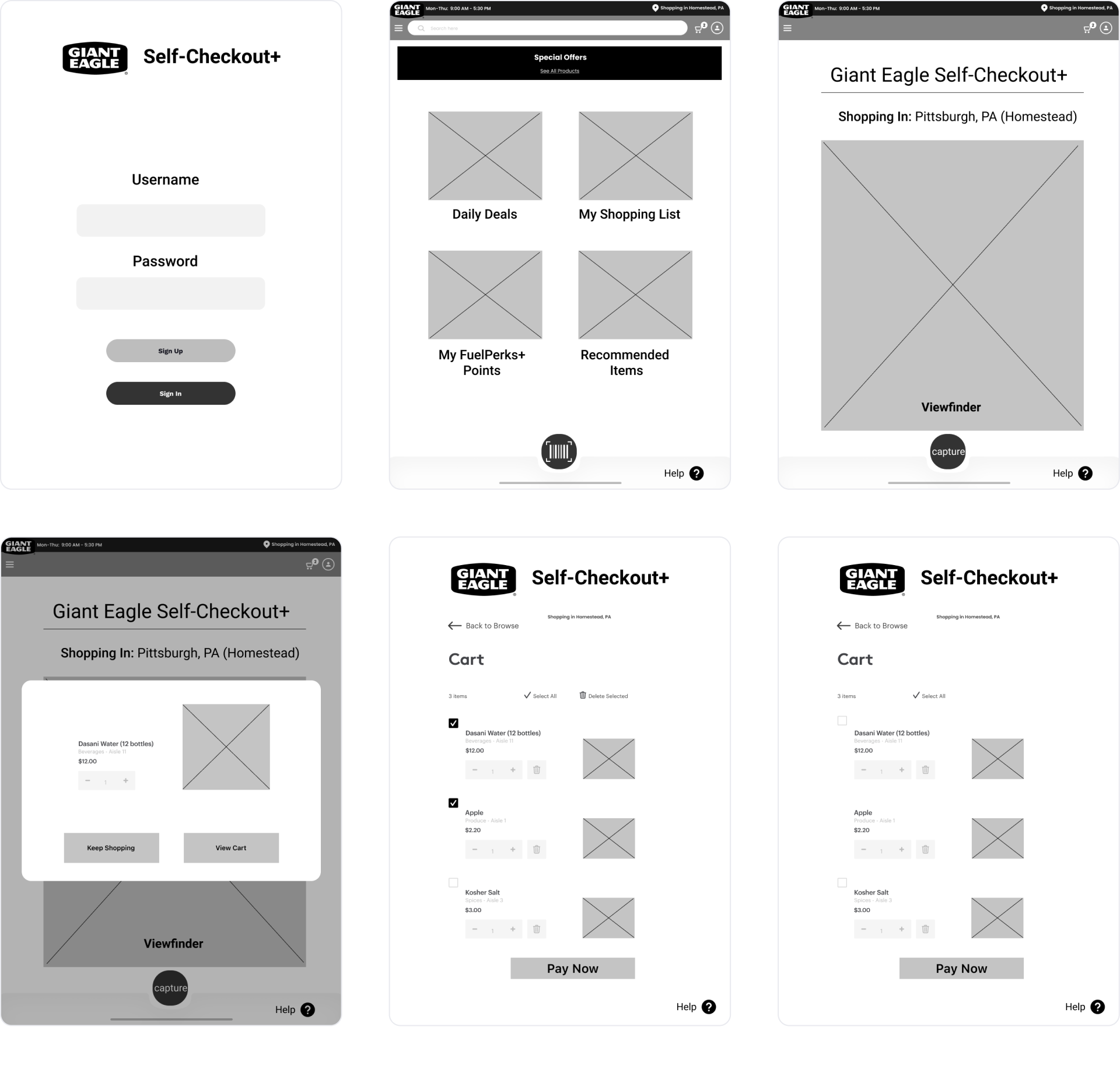
As we conducted user testing sessions, we made notable iterations to maximize visual real estate, provide error correction steps, and decrease cognitive overload.
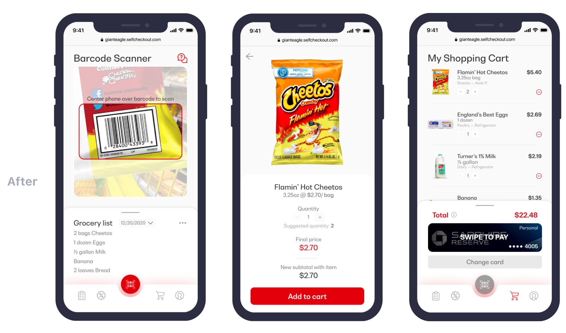

We used a mobile-first approach by prioritizing mobile iterations and applying these to the tablet version. On the tablet, we used a three-column layout to maximize visual real estate.

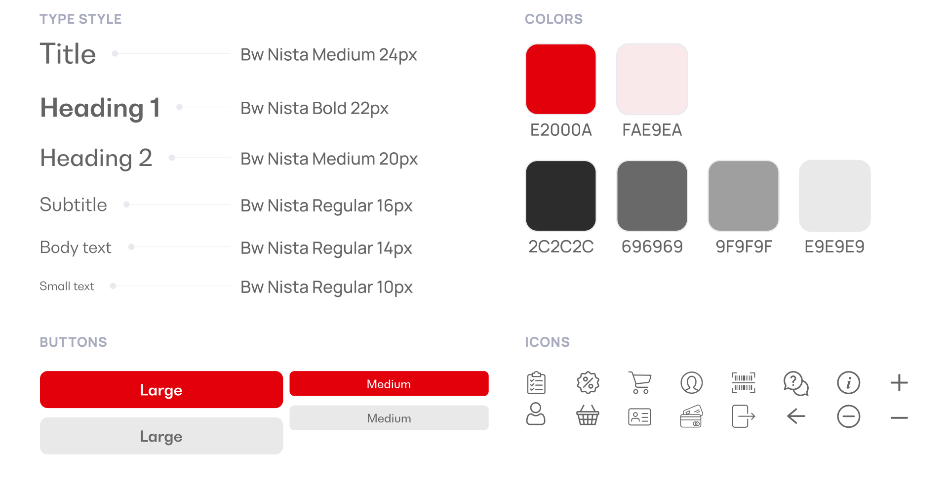
To maintain visual consistency across the team, I established and maintained the design system and implemented these styles as Figma components.
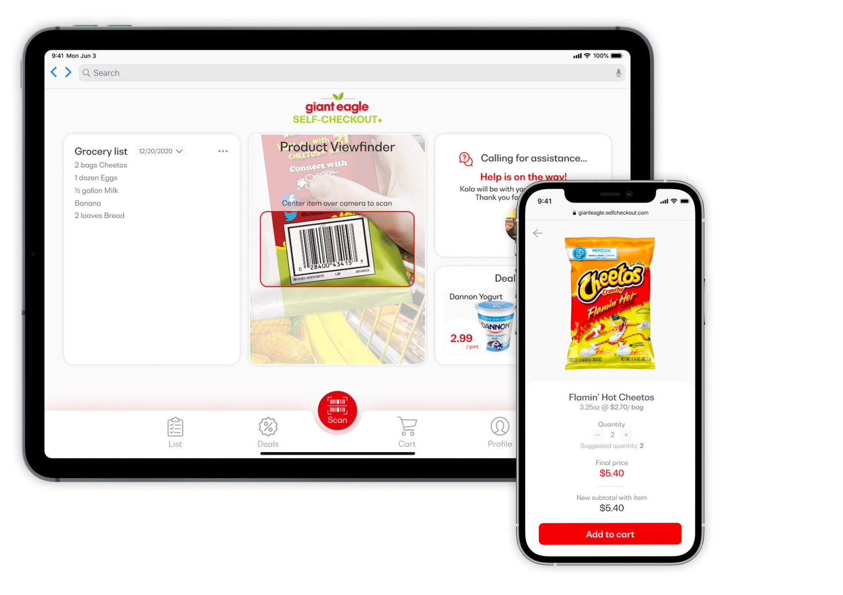
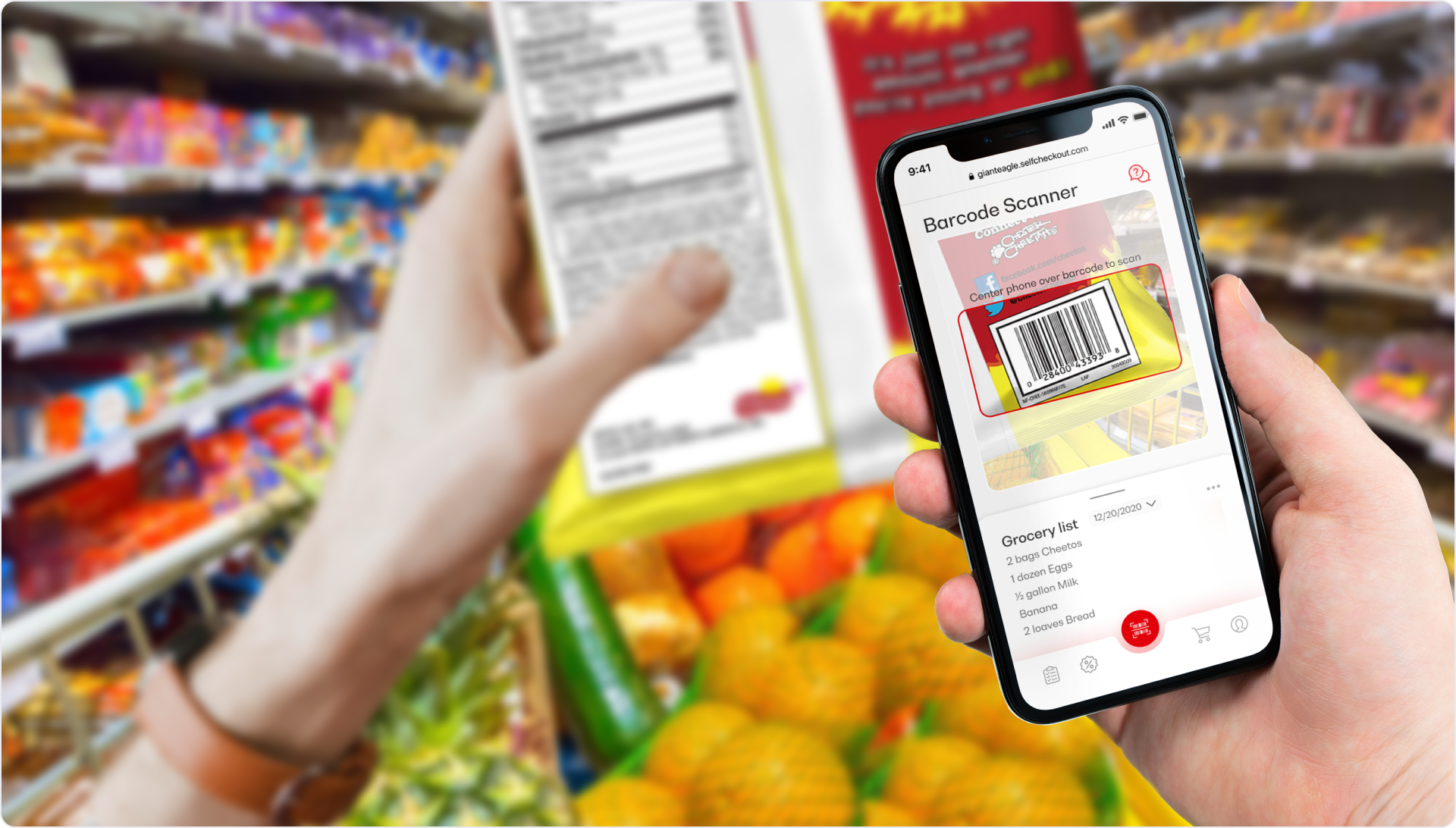
What is Self-Checkout+?
Self-Checkout+ is a web application
that allows Giant Eagle shoppers to plan a
grocery trip and scan items as they add them to their cart. Our team
initially considered implementing a store map with details on which
shelf each item is located, but this would
be too costly for the backend.
Self-Checkout+ is responsive
and comes in a mobile and tablet version.
With a mobile version, shoppers can use their phones in the store.
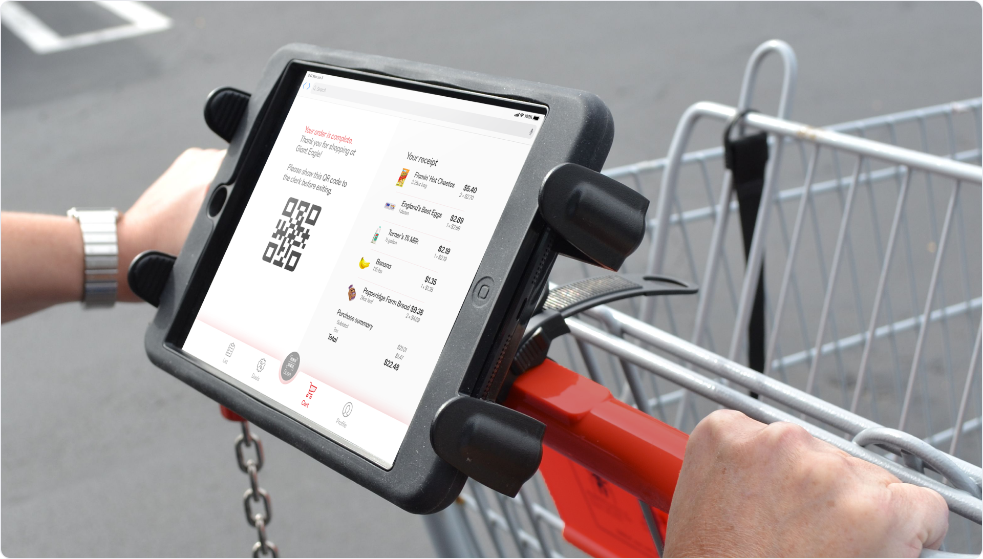
Giant Eagle will also mount tablets on shopping carts to streamline the checkout process.
Plan the next trip
Users browse through weekly deals and plan their next grocery trip from their homes.
Scan-as-you-go
Users can ask for help on their phones and view their grocery list as they scan items onto their carts.
Checkout in one swipe
Users swipe to pay and show their QR code for inspection before exiting the store.
I enjoyed working on this project and thinking more critically about how others experience the same spaces that I experience. Here are three main lessons I learned.
Lesson 1
Be quick to iterate and know when you are wrong—listen to the user.
Lesson 2
Use my background in business to realize product feasibility.
Lesson 3
Refine my skills in visual design across multiple devices.